The Indicator Statistics feature in Report Builder enables the author to modify the display of a widget that would show data for multiple features, by generating statistics for groups of features.
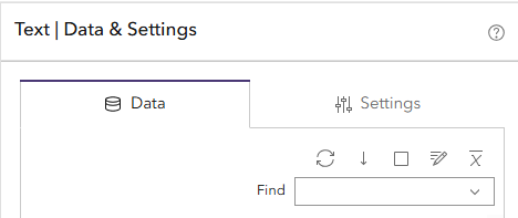
The Indicator Statistics settings are accessed by clicking the X button (first from the right) at the top of the Data tab.
This will open the Set indicator statistics window. As the warning in this window will tell you, you need to be using a widget that will show data for multiple features.
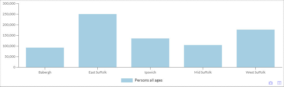
For example you may have a Bar Chart widget that has been configured to look like the one below.
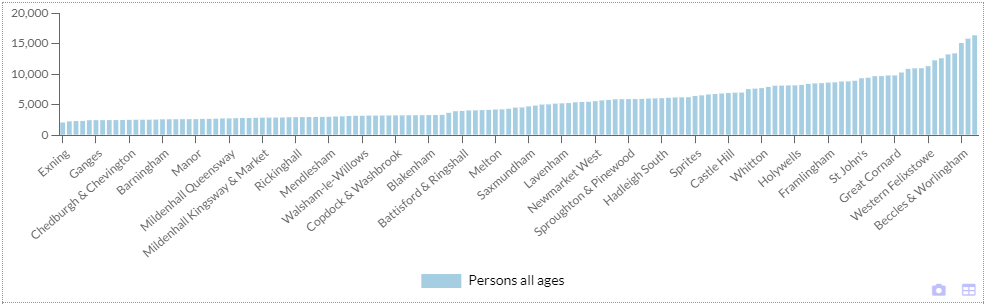
This chart is showing a population figure for each of the wards in the county of Suffolk in the UK. The report is based on a layer with the Suffolk wards as features, and the chart has been set to include all areas (Settings > Behavior > Include all areas). Note that there are so many wards that there is insufficient room on the X axis to label them all – the axis has therefore been set to show labels where it can.
You may prefer the chart to show the population for groups of wards rather than every single one – for one thing, that would get around the labelling problem.
Clicking the Indicator Statistics button in the Data tab would open the window shown below.
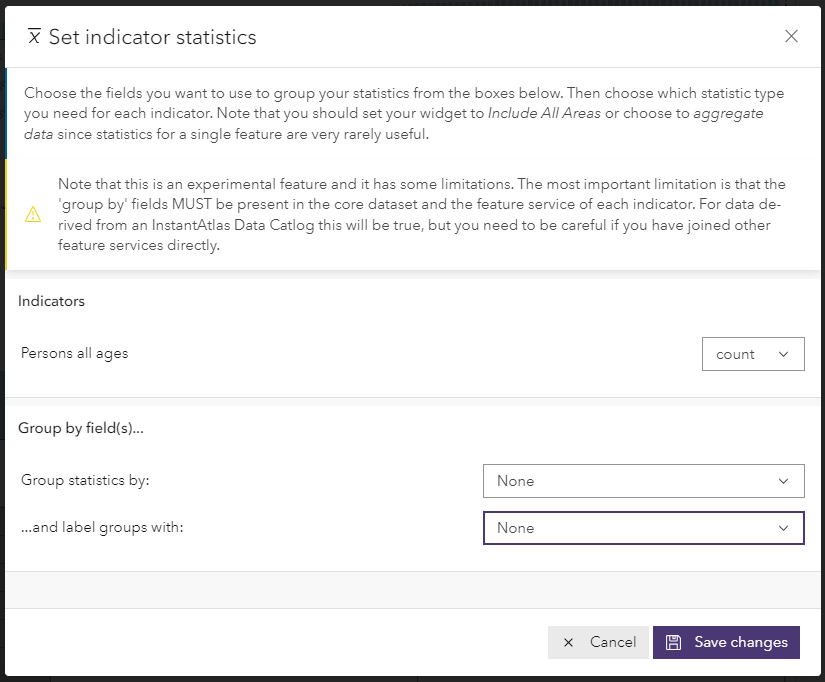
You could change the statistic for the Persons all ages to ‘sum’ using the drop down menu. You could then use the Group statistics by drop down menu to select the attribute field in your data layer containing the values used to group the wards. Finally, you could use the and label groups with drop down menu to select the attribute field in your data layer containing the values used to label the groups of wards.
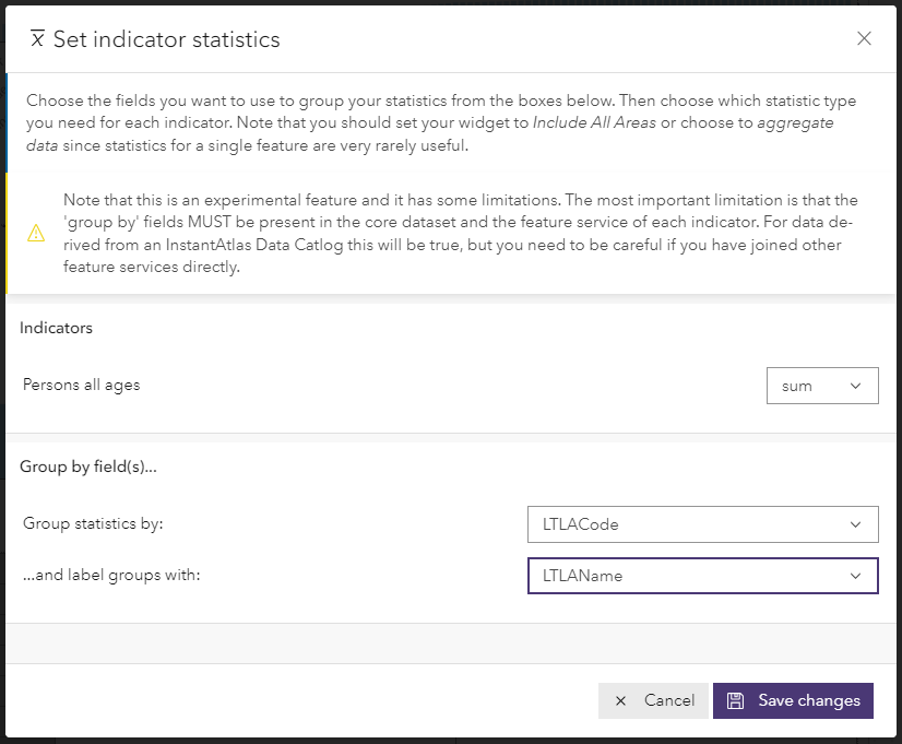
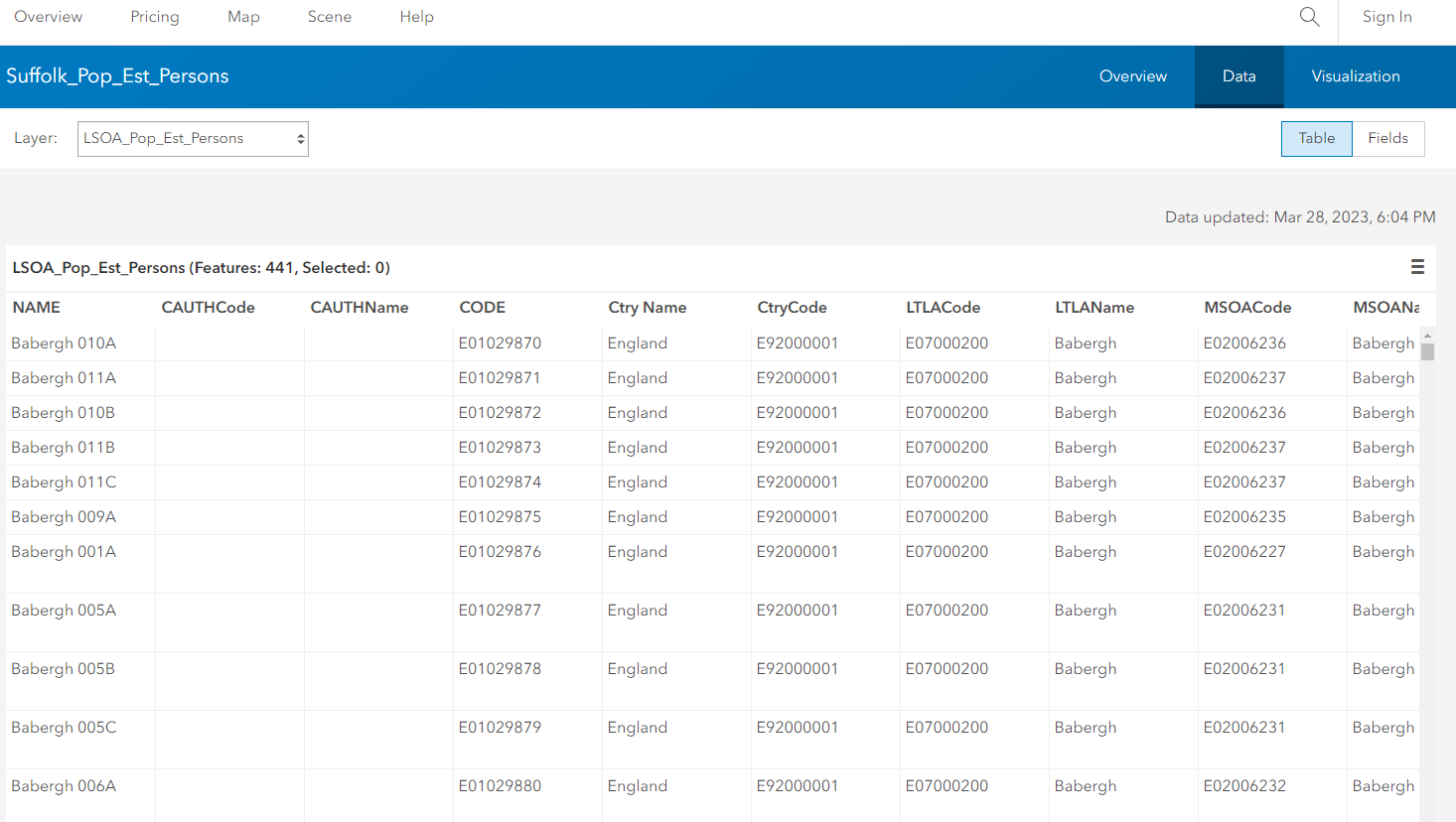
In this example, the data layer for this report contains fields called LTLACode and LTLANames that contain the codes and names of districts in Suffolk respectively (for those unfamiliar with UK geography, wards can be grouped by district). This can be seen in the attribute table for the layer, displayed below in ArcGIS Online.
After clicking Save changes, the bar chart would look like the one shown below. There is now one bar per district, showing the sum of the population figures for the wards within that district.
If the bars are configured to show labels, these will show the sums calculated by the indicator statistics feature.

This is just one example of the use of indicator statistics – there are other possible applications of this functionality.