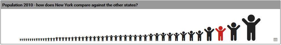
The Scaled Icon widget shows the size of data values using the size of an icon. It is useful to show how the selected feature is performing in comparison to the other features in the layer, or to compare the selected feature to comparison features such as the regional or country.
The section below describes specific settings for the Scaled Icon widget. Note that generic widget settings are described on the Widget Generic Settings page, so if you cannot find the setting you are looking for check there too.
Icon
Icon
Choose an icon for the widget. Type some text in the box to see any matching icons e.g. ‘male’ or use the arrow to the right of the box to access the list of available icons.
Size
Type or use the arrow buttons to set the size of the icon(s).
Type
Choose an icon type.
Image
Type the URL to an image or use the browse button to the right of the box. This setting will be greyed out if Type is not ‘image’.
Color
Choose a color for the icon(s). This setting will be greyed out if Type is not ‘icon’.
Tooltip
Type a tooltip format for the icon(s) e.g. #COLOR #FNAME, #INAME: #IVALUE
Scale between values
If you wish the icon(s) to scale between two values, type the two values separated by a comma e.g. ‘0,100’ or use the arrow to the right of the box to see suggested values.
Show labels
Choose whether to show labels for the icon(s) and if so, their position.
Label format
Type a label format for the icon(s) e.g. #INAME. This setting will be greyed out if Show labels is false.
Label color
Choose a label color for the icon(s). This setting will be greyed out if Show labels is false.
Label font size
Choose a label font size for the icon(s). This setting will be greyed out if Show labels is false.
Icons – Layout
Layout
Choose a layout for the icon(s).
Alignment
Choose an alignment for the icon(s).
Vertical alignment
Choose a vertical alignment for the icon(s).