This page describes specific settings for the Bar Chart widget. Note that generic widget settings are described on the Widget Generic Settings page, so if you cannot find the setting you are looking for check there too. It is good practice to design your charts to be as accessible as possible.
Bars
Orientation
Choose between vertical or horizontal bars
Width
Set the bar width
Tooltip format
Choose the tooltip format. Click the arrow on the right to see suggested values. If you wish to add confidence limit values to the tooltip you can use the variables #YMIN and #YMAX.
Sort bars by value
Choose whether bars should be sorted by data value, and if so ascending or descending order. This setting is only active if the Type setting under Series is set to indicators-as-series and if Include all areas under Behavior is toggled on.
Include comparison bars in sort
You can configure if comparison bars are displayed at the right of all other bars or included in the core feature bar sorting. This setting is only active if the Type setting under Series is set to indicators-as-series and if Include all areas under Behavior is toggled on.
Use stacked bars
Click the toggle to show stacked bars. Your data must be able to support this and it is likely that you will need to adjust other settings to combine with this one. This is often used to show multiple indicator values in a single bar. Bars will be grouped by date if time series data has been defined.
Comparisons as lines
Click the toggle to show comparison features as lines rather than bars.
Data Labels
Show value labels
Set if you wish labels to be shown on bars, comparison lines (lines), both or none.
Value labels style
If you are showing value labels, choose between text and badge.
Value labels format
You can set the format of the label. This can be a combination of a variable and static text e.g. #VALY %
Value labels font size
If you are showing value labels on bars, set the font size in pixels. -1 means it will use the default font size.
Value labels anchor
You can anchor the labels at the start, middle or end of the bars.
Value labels color
This changes the text colour of the data labels.
Value labels background color
This setting is visible only when the badge style is selected. It allows you to change the background colour of the badges. If not set the background inherits the colour of the bar or line it belongs to. You can also chose a transparent background.
Value labels border color
This setting is visible only when the badge style is selected. it allows you to define a border colour for the badges.
Value labels border width
This setting is visible only when the badge style is selected. It adjusts the border width of the badge labels.
Value labels border radius
This setting is visible only when the badge style is selected. By default, badge style labels have rounded corners. This setting allows you to adjust the corner radius to create badges with more defined corners.
Value labels rotation
If you width the labels to appear in an angle you can set the rotation in degrees. Moving the slider to the right rotates the label clockwise, to the left counter-clockwise.
Axes
Font
Type the name of the font you would like to use for axis text into the box.
Font size
Type into the box or use the arrows to set the font size for axis text.
X axis label format
Choose a label format for the X axis. Refer to the Variables page for information on the possible values.
X axis title
Type a title that will be displayed for the X axis.
Y axis number format
Choose a number format for the Y axis. Refer to the Number Formats page for more information.
Y axis title
Type a title that will be displayed on the Y axis e.g. ‘Percentage’ or ‘Rate per 1000’
Colors & Highlights
Palette
Choose a color palette for the widget. You can edit the active palette by clicking the x buttons to remove colors or the + button to add colors. There are also buttons to change to a different palette completely, to copy/paste color codes to/from the clipboard and to toggle the direct edit view that allows you to type in color codes delimited by commas e.g. #a6cee3 #b2df8a #fb9a99 #fdbf6f #cab2d6 #ffff99 #1f78b4 #33a02c #e31a1c #ff7f00.
Chart background color
Choose a background color for the chart.
Highlight selected feature
Choose whether you would like the widget to highlight the selected feature.
Highlight color
Choose a highlight color for the selected feature. This setting will be greyed out if Highlight selected feature is false.
Highlight style
Choose a highlight style for the selected feature.
Limits & Error Bars
Please refer to this page for the use of these settings.
Annotations – Lines and Zones
Bar charts can show fixed lines or zones additionally to the displayed indicator(s). You can add up to 4 lines and up to 4 zones to the chart. Each line has it’s own fixed value, label, color, width and style. For each zone, the start and end value, label, color and opacity can be defined. Lines and zones can be added to either the x or the y axis allowing for a wide rage of use cases.
Statistics
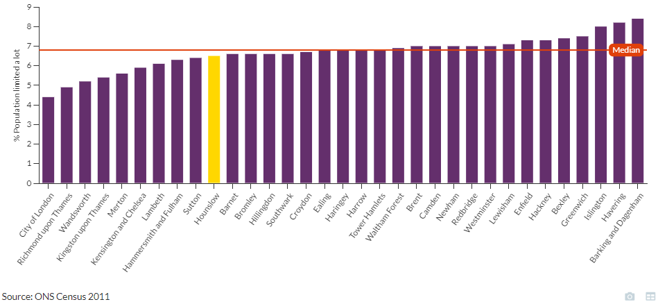
You can chose to display the mean and/or median line either superimposed over or behind the bars of your bar chart. The label, line style and color can be adjusted.